How to Edit your Shopify Checkout Page: 15 Powerful Strategies to Test (with Examples)
.jpg)
Editing your Shopify checkout page is not something most merchants consider. But that data tells us that they should.
According to Little Data, checkout completion rates for Shopify stores average out at 45.2% on desktop devices, rising to 58.7% for stores in the top performing 20%.
While mobile checkout completions are slightly lower, with an overall average of 44%, and only the top 10% of stores achieving completion rates of 63.9% or higher.
So that tells us something: the best performing checkouts perform between 14-20% better than the average ones.
Seriously, imagine if you could increase your checkout completion by 20%? For most merchants, their business would look radically different if they pulled that off.
To that end, in this post, we'll show you how you can edit your Shopify checkout page that boosts sales.
We’ll cover how to edit your Shopify checkout page for non-plus users and also some more advanced checkout customizations you can do on Shopify Plus. We’ll have examples of some of the best performing checkout pages you can copy too.
So, ready to jump in? Let’s go!
Shopify Checkout Page Best Practices
Before we jump into the best Shopify checkout pages, let’s get familiar with the principles of a good checkout experience.
Ultimately what causes customers to abandon their checkout is friction. Now, friction can come from many sources - it might be having to re-enter information twice, or it might be psychological friction about how trustworthy your brand is.
Wherever the friction comes from, here's the universal best practices that apply to pretty much every checkout on the internet.
- Minimize distractions at checkout (e.g. cut links back to the homepage)
- Ask once for information (and only request essential information)
- Offer both guest & express checkout options
- Make it easy to apply discounts & coupons
- Use a progress indicator, and limit it to three steps maximum
- Make it easy to access support form checkout
- Showcase trust signals/social proof where appropriate
- Highlight the perks (such as free shipping)
- Offer multiple shipping options
Now, since you’re using Shopify checkout, thankfully many of these checkout optimizations come as standard. The guys who built shopify’s checkout definitely did their homework.
That said, with a clear discrepancy in conversion rates between average stores and high performing stores, what else can you do to optimize your checkout experience?
Well, lets’ begin with some basic customizations that every merchant on every plan can do (regardless of what plan you’re one)
Then we’ll move on to more advanced strategies that some of the top Shopify stores are using to pump-up their conversion rates and take home more bacon.
{{cool-component="/style"}}
How to Edit the Shopify Checkout Page (Non-Plus Users)
If you are a Shopify Plus customer, you have the ability to fully customize the layout of the checkout page using the checkout.liquid and checkout.scss.liquid files in the theme editor section of your Shopify store's admin panel.
If you’re not a Shopify Plus store, then you’re more limited in the checkout customizations you can make. However, you can still edit elements like your logo, your form length, page colors, text and more.
For non-plus Shopify stores, here's the steps to edit your checkout page:
- Go to the "Online Store" section in your Shopify store's admin panel and select "Themes."
- Click "Customize" to customize the theme's components.
- From the left-side theme navigation, select "Checkout."
- Update the banner, logo, main content area, and order summary for the checkout page. (Note that Shopify stores can only edit these components. To make more extensive updates to the theme layout, you need to be a Shopify Plus customer.)
- Click "Save" to complete the process.
Simple Shopify Checkout Page Customizations Everyone Can Do
Using the above method for regular Shopify accounts, there are a couple of useful edits you can make to try and boost your checkout conversion rate.
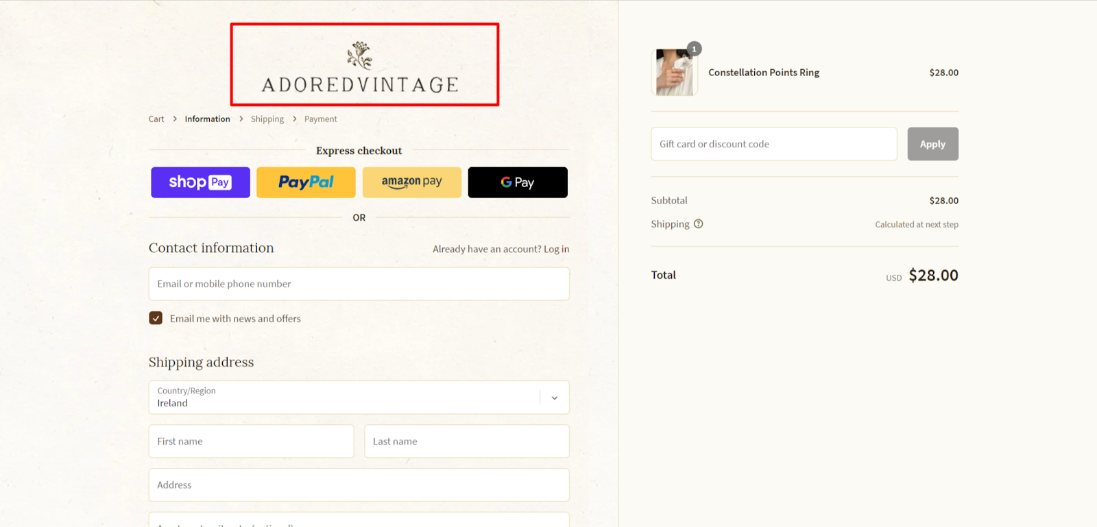
- Incorporate your logo onto the checkout page, ensuring that it remains visible from one page to another like Adored Vintage do:
- Modify the colors of page sections, text, links, and buttons to match your brand elements instead of leaving default colors. You can also set a background image for main page content and order summary, but ensure that it does not hamper the visibility of information in these areas.
- Shopify provides several fonts that can be used to personalize the look of the checkout page as above.
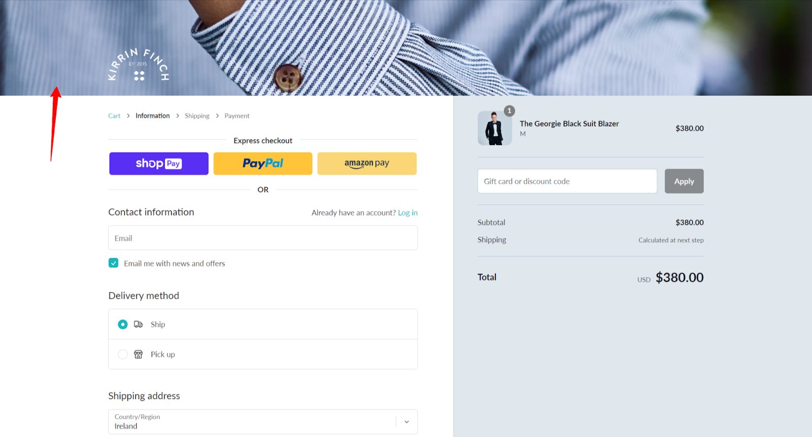
- Include a branded banner or relevant image as a header, which can dramatically alter the appearance of your checkout page like Kirrin Finch do:
How to Edit The Shopify Checkout Page (Shopify Plus Users)
If you are a Shopify Plus customer, you can fully customize the checkout, including checkout logic. Follow these steps to edit your checkout page:
- Go to the "Online Store" section in your Shopify store's admin panel and select "Themes."
- Click the "Actions" drop-down menu in the "Current Theme" section and select "Edit Code."
- Select the "checkout.liquid" file (or "checkout.scss.liquid" for styling) to make the necessary updates.
- Click "Preview" to view the changes you made.
- Click "Save" to complete the process.
Now, we strongly advise against editing your checkout code unless you’re an experienced coder. Messing things up here could dramatically affect your conversion rate.
If you’re not a coder, ReConvert allows Shopify Plus users to edit their checkout using a drag and drop editor. If you haven’t tried it yet, get started with a free trial and see what you can do!
Now, let’s move on to see some of the best checkout customizations you can do, looking at some of Shopify’s biggest stores for inspiration.
15 Shopify Checkout Page Examples to Learn From
With the universal checkout best practices under our belts, let’s delve into how you can edit your Shopify checkout to convert more of your hard earned traffic into sales.
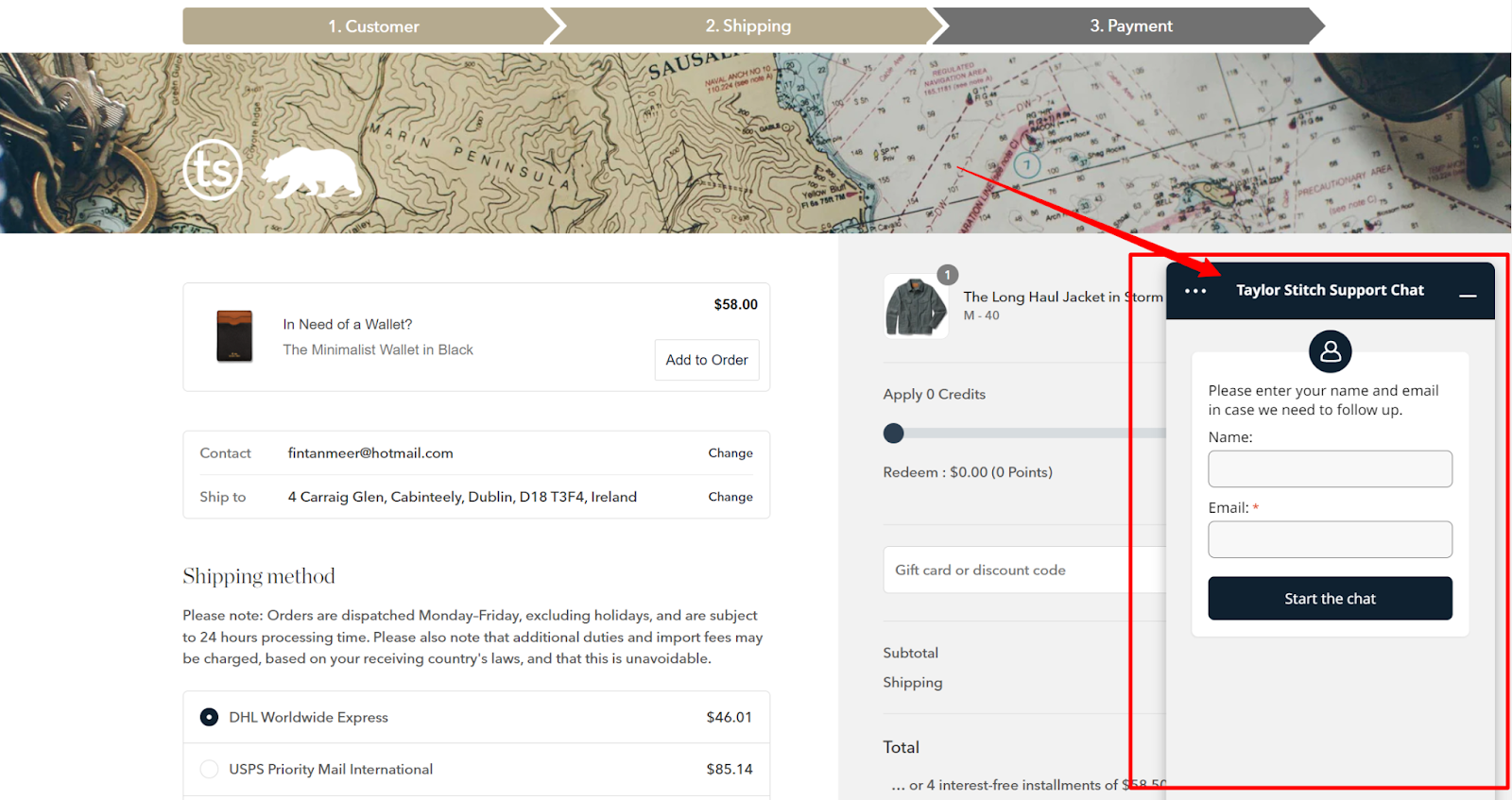
1. Suggested Related Products to Boost Cart Value
One of the easiest ways to instantly boost your revenue is by adding cross-sells to your checkout pages.
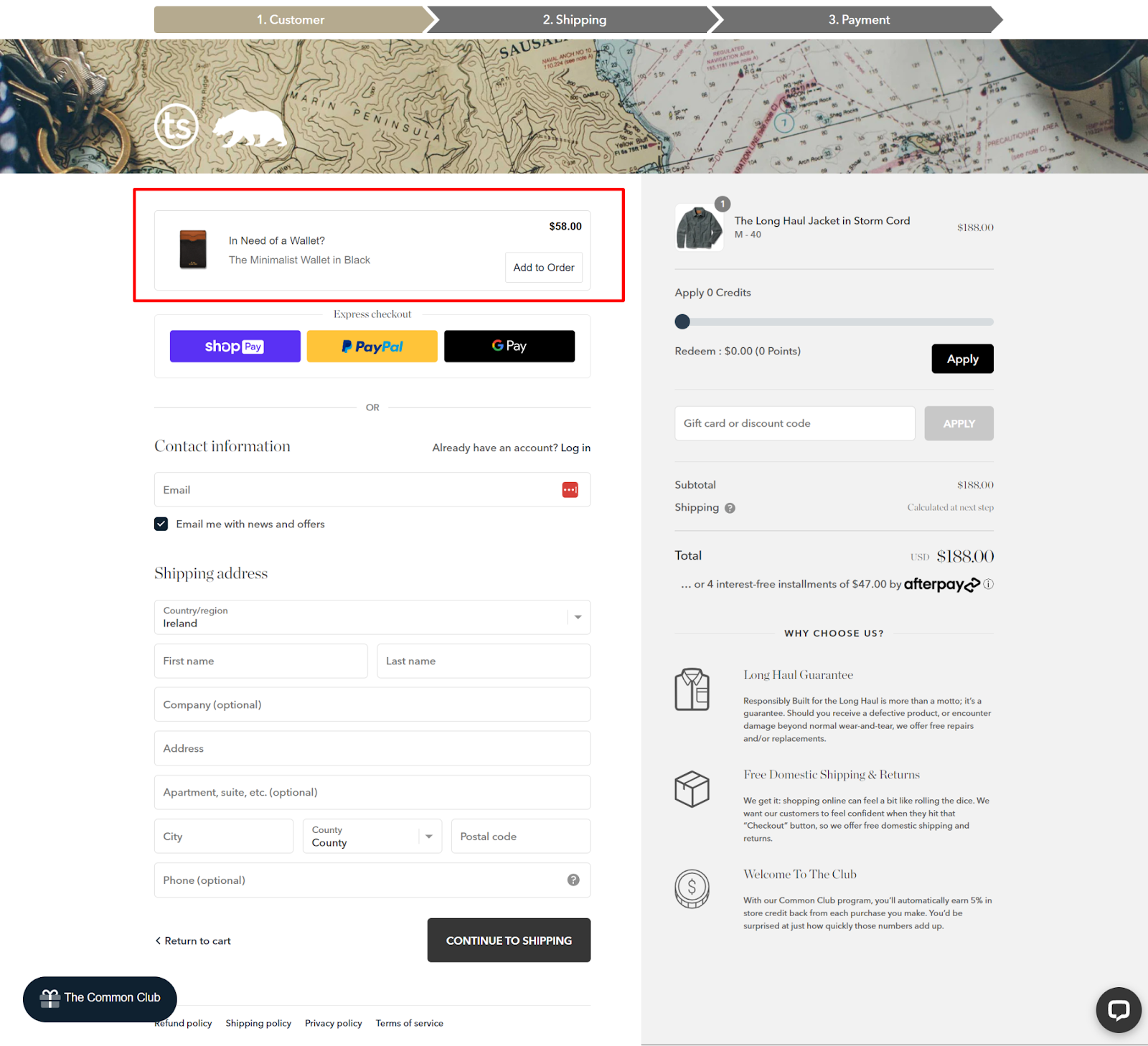
For example, look at this checkout page cross-sell from clothing brand Taylor Stitch. It’s subtle, but powerful. As you’re checking out you’re gently prompted with a cross-sell offer.
This type of cross-sell works so well because:
- It’s unintrusive
- The impressions come from high-intent shoppers
- It compliments the normal buyer's journey
You can play around with the placement of your offer and see where converts best. For example here’s another Shopify checkout page with offers from nutrition brand Soylent:

To really step-up conversions, use personalization here. Suggest products that make sense based on what’s in your customer’s cart and their purchase and browsing history.
When you do that, you’ll see a nice boost in your average order value for very little extra effort.
Pro Tip: Implementing checkout upsells with custom code is tedious and difficult. Instead, use ReConvert to trigger based checkout upsells to your Shopify Plus store in minutes.
{{cool-component="/style"}}
2. Add Urgency to Drive More Conversions
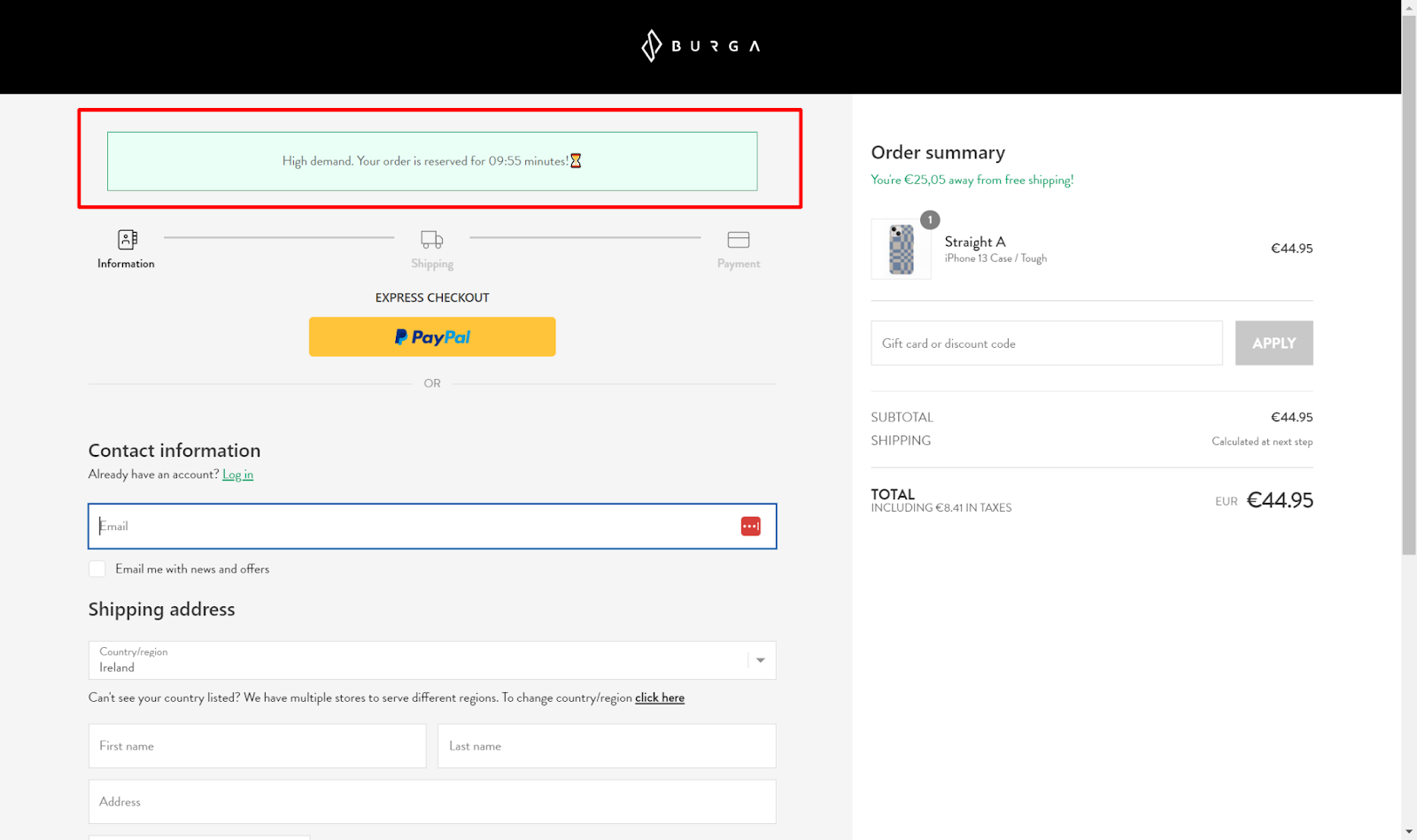
Scarcity and urgency are two powerful forces that drive customer behavior. Burga uses a timer on their checkout page to encourage customers to take immediate action:
While this tactic mightn’t be for every brand - it’s certainly worth a test if you’re experiencing unusually high levels of cart abandonment or are selling in a niche where brand equity doesn’t count for much.
Just make sure you don’t plaster a big spammy timer at checkout which might harm trust and cause people to think twice about their purchase. And also ensure you give people enough time to complete checkout before the timer expires.
3. Collect Marketing Consent
According to regulation 13 of the ePrivacy Regulations (SI 336/2011), your European customers must give consent for you to contact them with marketing messages.
While GDPR has caused compliance headaches for marketers everywhere, one clever way to obtain consent is to use a checkout page like skincare brand Then I met You:

While GDPR forbids using pre-ticked boxes, Then I Met You clever email SMS sign-up appears as part of the regular checkout flow - which means customers are likely to opt-in as they quickly scan down the page.
And as Richard H. Thaler says in his iconic book ‘Nudge’ - “The combination of loss aversion with mindless choosing implies that if an option is designated as the “default,” it will attract a large market share. Default options thus act as powerful nudges.”
This small, but significant nudge will greatly increase the size of your available audience and amplify your email marketing results down the line.
Pro Tip: Use ReConvert to add an even bigger nudge to your checkout page - offer a 10% discount code to customers who opt-in for marketing. Then nudge them again at a later date to remind them their code is about to expire. Repeat customers, here we come!
4. Remove the ‘Return to Cart’ Button
Sometimes the simplest changes can reap the greatest rewards. If you do nothing else to your checkout, remove the 'return to cart' link and watch your order volume increase.
As standard, Shopify checkouts include a ‘return to cart’ button that looks like this:
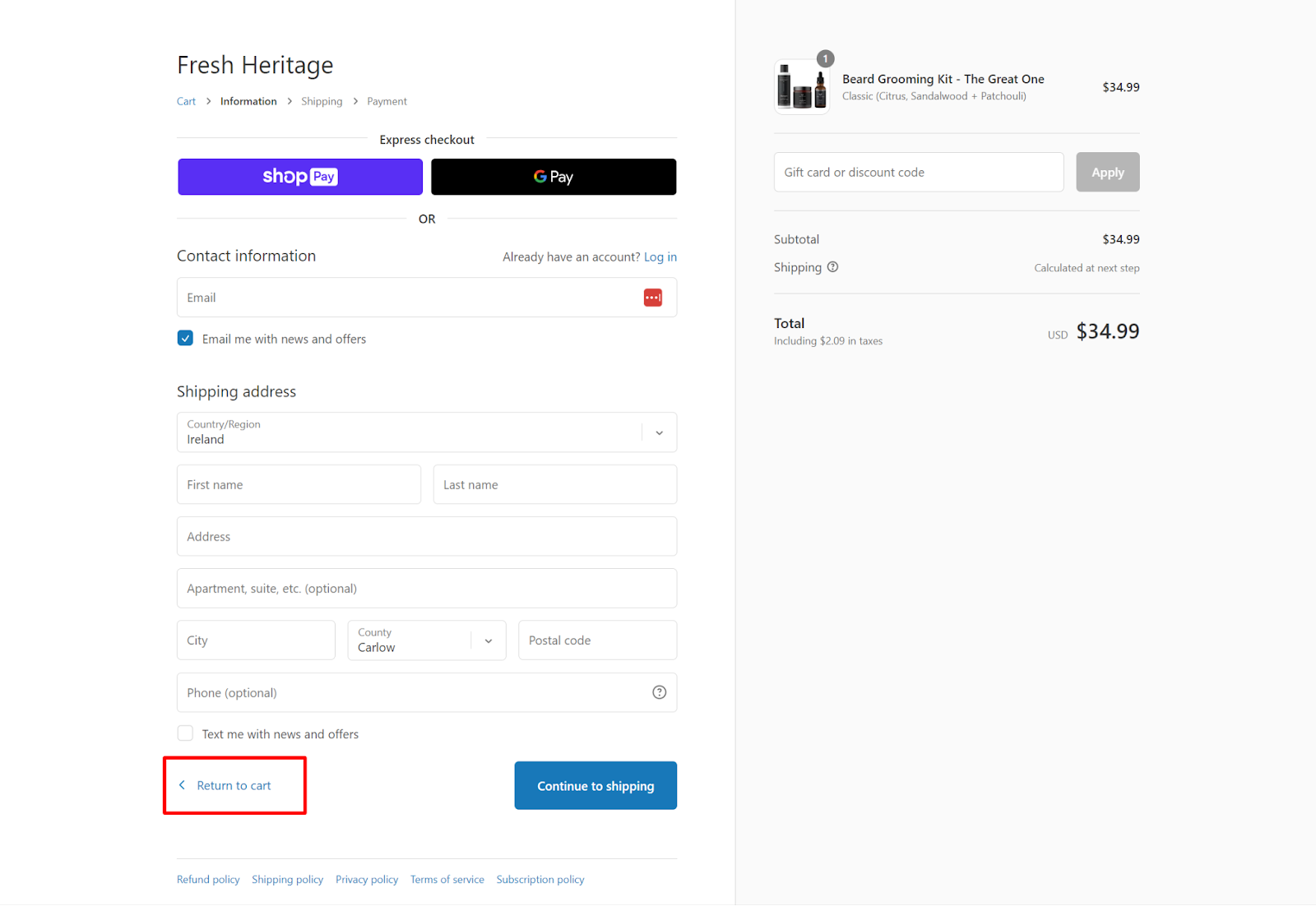
"We've run A/B tests hiding the 'Return to cart' link in checkout." Says Yusuf Shurbaji from CRO agency Prismfly. "We've seen this change increase order volume by up to 10% with over 95% statistical significance" he adds.
Yup, you read that right. An increase in order volume by 10% from an upgrade that won't take you more than a couple of minutes to implement.
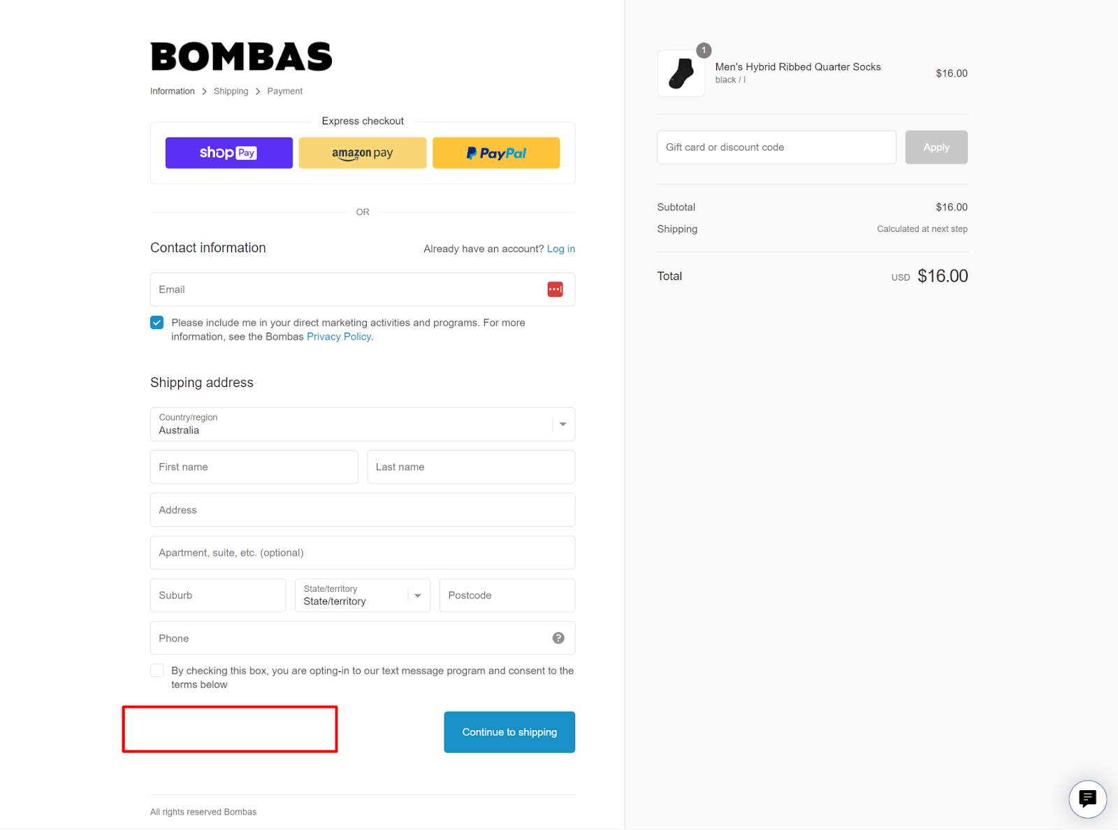
Pro Tip: Increasly have put together a simple step-by-step guide to help you remove the 'return to cart' link from your checkout page.
5. Only Ask for Essential Information
If a customer decides to buy, your job is to make it as easy for them to do so.
The more hoops they have to jump through, the less customers will actually make it to the end and convert. Take this study on form length from Marketing Experiments for example:
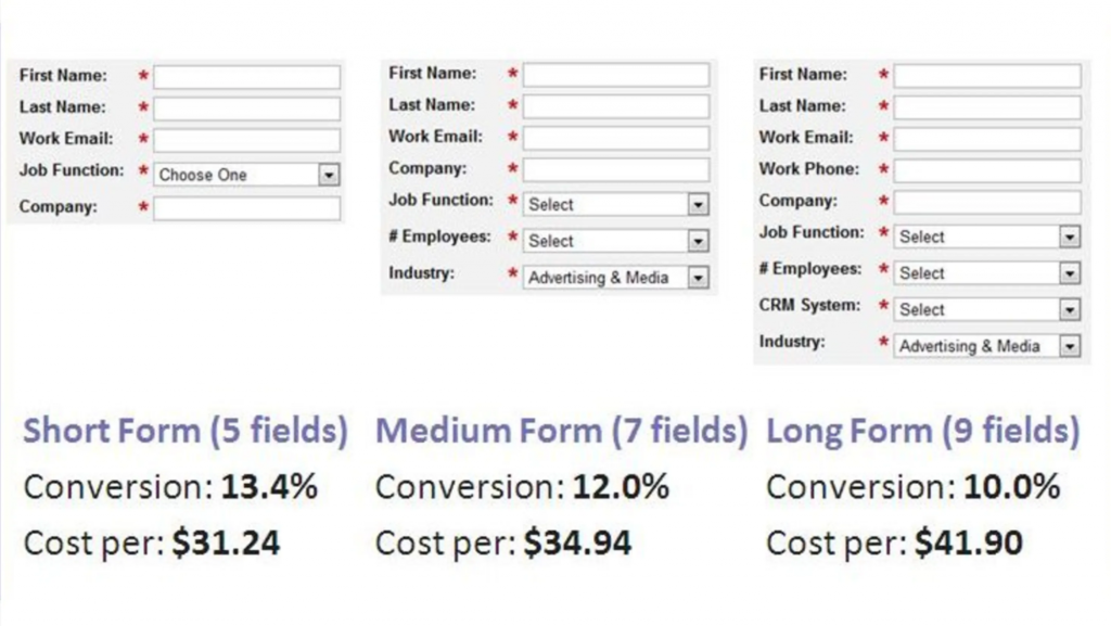
So the aim of the game is to shorten your forms to collect only essential information like shoe-retailer Allbirds does:
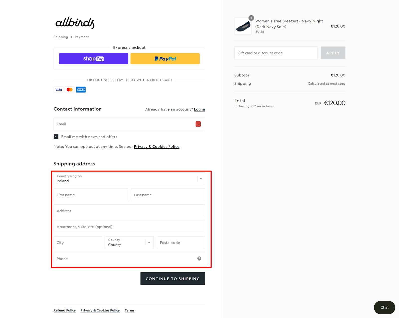
All birds chopped their customer form down to size. They’ve removed unnecessary fields like ‘Company’ for example.
What’s more, they have a two-step checkout process. See in the top right corner where they have ‘Shipping’ and it goes straight to ‘Payment’? You can bet that this perceived reduction in steps required results in an increase in conversions.
6. Add a Message Field to Your Shopify Checkout
Sometimes customer’s have special requests accompanying their order. Or perhaps they’re gifting an item and want to include a note to the recipient.
Either way, it can be helpful to have a form where customers can leave comments at checkout. For example, look at hoe clothing brand True Classic cleverly inserted a form on their checkout page:

What we love about this form is that it doesn’t appear until you tick the ‘Add Gift Note (optional)’ box which minimizes distractions for those who don't want to avail of it.
Pro Tip: Coding this is tricky. Instead use ReConvert to instantly add customer notes to your checkout and give your shoppers an ungraded experience.
7. Show Pricing Breakdowns
According to research, 55% of shoppers abandon their shopping carts because of unclear extra charges.
To address this issue, it's important to clearly display the breakdown of the entire payment due, including taxes, shipping costs, and the product itself. For the most part, we’d advise including tax where possible - however this may not be feasible depending on your tax obligations.
Here’s how kitchenware brand MadeIn does it:
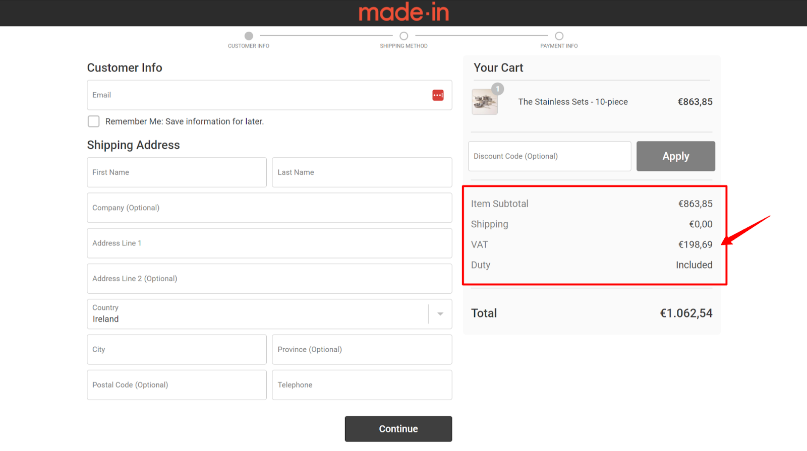
Lots of Shopify stores have now incorporated this pricing breakdown as a checkout customization to further enhance transparency. Here’s how to add this feature to your store:
- Go to your Shopify admin and click on "Online stores".
- Click on "Actions" and select "Edit languages".
- In the search box, type "Vat label html" and press enter.
- Under "Checkout & system / Checkout order summary", enter "{{ amount }} tax included" in the "Vat label html" text box.
- Click "Save" to confirm the changes.
- By providing a clear pricing breakdown, you can help new shoppers feel more confident about their transactions and reduce the likelihood of cart abandonment.
Pro Tip: MadeIn have edited the name of their shipping options to include estimated delivery times. This is a powerful way to help customers select the best option for their needs and reduce uncertainty.
8. Use Customer Accounts (The Right Way)
Customer accounts are a kind of a double-edged sword for merchants. On the one hand, customer accounts allow you to gather more data (e.g. purchase history) and tailor your marketing.
On the other hand, setting up an account introduces friction into the checkout process and can hamper your conversion rate.
So, what's a merchant to do? Well, as Yusuf Shurbaji, co-founder of Shopify Plus Agency Prismfly says, the wisest approach is to make accounts optional before checkout and then strategically offer account creation post-purchase.
"Historically, accounts were needed to perform functions where data is saved and accessed from between sessions or devices. But in a modern eCommerce technology stack, having an email input alone or leveraging first-party cookies is sufficient enough to complete tasks such as returns, changing a subscription, or viewing a wish list.”
“Don't gate your checkout behind an account because it's a frustrating barrier. Instead, promote account creation when it is most valuable i.e. after purchase where creating an account is a means of saving and re-accessing valuable information later."
Athleisure brand Gymshark understands this - when you checkout as a guest on their site, you're prompted to create an account on the order confirmation page.
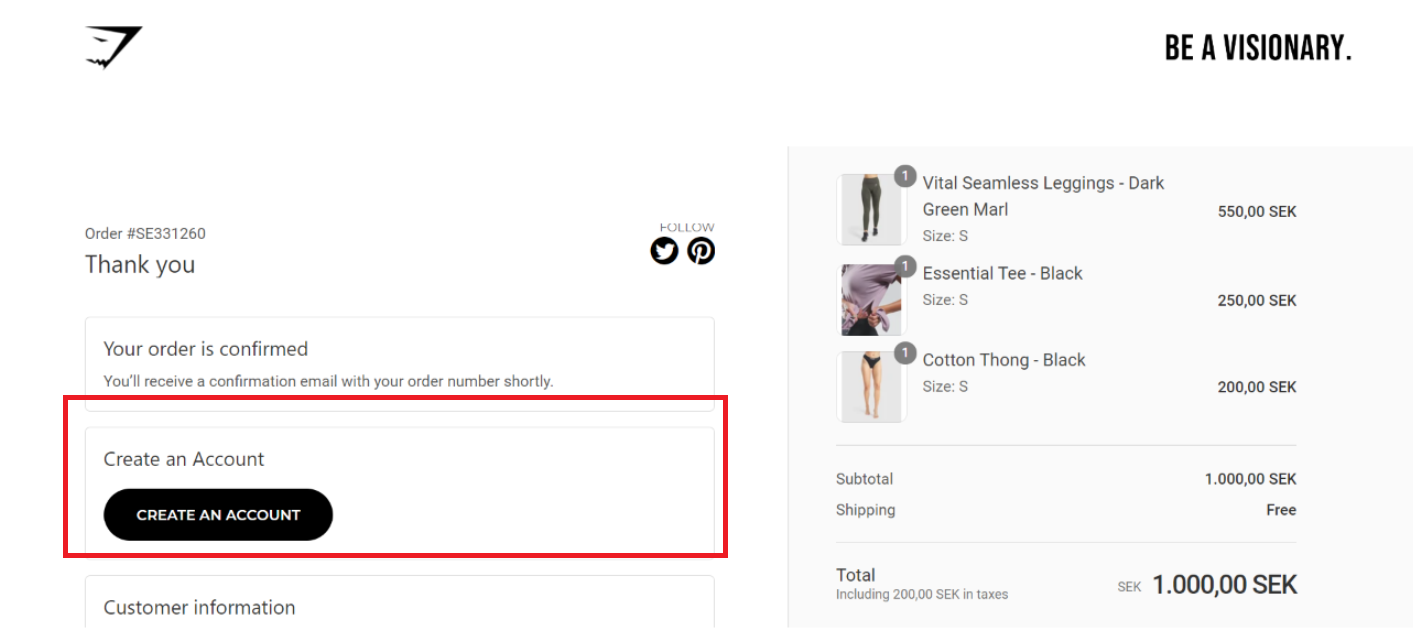
This way, prospective customers aren’t discouraged by having to create an account before completing the order. Meaning you’ll capture more sales, and more accounts too!
9. Leverage Live Chat to Overcome Objections
Ever been in a physical store and wanted to ask the staff a question about your purchase?
Hopefully by the time your customers reach checkout, they’ve got all the information they need to purchase.
However, sometimes questions bubble up into your shoppers mind as they’re checking out. Maybe they want to double check the return policy, or need help with a discount code that doesn’t seem to work.
Whatever the case, it’s a good idea to have live chat on hand to answer questions and convert customers before they click away.
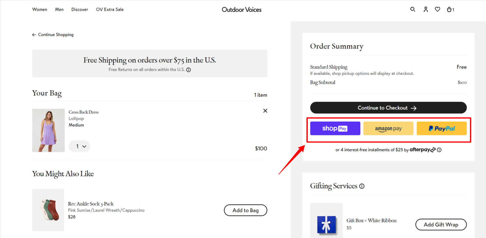
10. Offer Multiple Payment Options (Especially Express Options)
Just like everyone has a favorite color, every customer has a preferred payment method. That means, the more payment options you offer, the greater chance you have of converting more customers.
If it’s possible, you should offer express checkout options like Package Free does here offerfin ShopPay, Paypal and GPay:

What’s more, you can even display express checkout options on your cart page like Outdoor Voices does. This will allow customers to skip the first step of the checkout process and boost the likelihood they’ll complete their purchase.
Along with multiple payment options, it’s worth thinking about adding split payment options to your store too. Sometimes, customers won't have all of the cash on-hand to buy everything they want. Or they're not willing to make any big investments upfront.
Allowing shoppers to break up their payments with an app like Clearpay or Split will net you more conversions - especially if your average order value is relatively high. Another similar option is to add AfterPay to Shopify.
11. Offer Multiple Shipping Options
Delivery is a major component of your store’s ecommerce experience. Nowadays, customers expect to have shipping options that suit their needs.
Take a leaf out of Taylor Stitch’s book and provide your customers with a variety of shipping options, and the ability to customize shipping details.
You'll get the most conversions when you give customers the power to personalize delivery times and choose between delivery providers to get the experience they prefer.

12. Add Social Proof to the Shopify Checkout to Boost Buyer Confidence
Online shopping has inherent risks. Often, first time customers aren’t sure if your business is reputable. One useful tactic is to soother shopper concerns with the balm of social proof.
We know that people are very likely to trust recommendations from others online - even if they’ve never met them in real life. So, showcasing customer reviews at checkout can help build enough trust to get shoppers over the line.

13. Remind Customers Why They’ve Made the Right Choice
It’s super common to hesitate before buying something. In the heat of the moment, lots of shoppers second guess their decision.
So, providing shoppers with a couple of reasons why they’ve made the right choice and help shoppers overcome their doubts.
For example, Taylor Stitch reminds shoppers that customers get free repairs on all clothing, that shipping and returns are free and that they’ll also join the brand’s member’s club which will give them 5% credit back on each purchase.
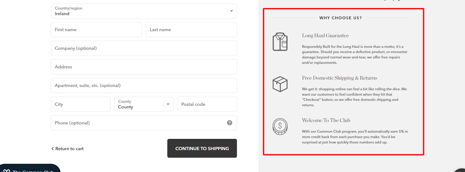
These benefits help shoppers overcome some common objections such as ‘“What if the product doesn’t fit me?’ and ‘What if the quality isn’t up to scratch?’.
Reminding customers of the benefits of choosing your brand is a clever and low effort way to edit your Shopify checkout for better results.
14. Collect Feedback Right after Checkout
Collecting customer feedback is plagued by two problems: dismally low response rates and a lack of accurate information.
Asking customers for feedback on your thank you page is the best way to overcome both of these issues. Thanks to the psychological principle of consistency, people who’ve said yes to you once (i.e. bought from you) are highly likely to comply with your subsequent requests.
And unlike traditional email surveys, your thank you page is seen by pretty much everyone who shops in your store (our figures indicate that the average shopper views the thank you page 2.2. Ppr order)
What’s more is that thank you page surveys collect feedback when it’s still fresh in the customer's mind.
But you don’t only have to use post-purchase surveys for feedback. Shaving brand Harry’s uses their thank you page survey to segment customers based on shaving frequency:

This clever tactic allows them to build a more personalized post-purchase communication strategy and follow up with customers when they’re most likely to need to order again.
While it’s not specifically a shopify checkout customization, collecting feedback on your order confirmation page is a smart move that’ll help you level-up your ecommerce experience and sharpen your marketing.
15. Use a One-Page Checkout Page
A one page checkout can significantly lower the friction required to complete a purchase. They require less effort from customers to complete and generally they’ll result in higher conversion rates.
That said, a one page checkout requires a lot of information from customers in one fell swoop - which can make it seem like more work. Plus, you also miss a lot of valuable data if you’re using pixelated advertising platforms since you’ll only get a sale, or an abandoned cart.

At the time of writing this feature isn’t available in Shopify. However, it’s coming soon for Shopify Plus users, so keep your eyes peeled. Head over to Shopify’s payments page to sign-up for early access.
How to Test Your Shopify Checkout Flow
Whenever you make any changes to your Shopify Checkout, you’ll want to test it to make sure that everything is working properly.
This is especially important if you’re changing your payment settings. There’s nothing worse than a payment processor issue preventing your customer’s from checking out.
To place a test order, you can simulate a transaction using Shopify's Bogus Gateway or, if you're using Shopify Payments, use the test mode feature to test your configuration.
Alternatively, you can use a real payment provider and immediately cancel and refund the order. However, be aware that you may be subject to fees from the payment processor used.
Here’s a video from Shopify covering everything you need to know.
Go Forth & Edit Your Shopify Checkout!
Customizing your Shopify checkout is an awesome way to boost conversions and make more sales.
Regular Shopify users are pretty limited in what they can do. However if you’re on Shopify plus, you can fully customize your checkout to deliver a better experience.
The key to making conversion rate improvements is running A/B tests. For this you just want to make one edit at a time and compare it against your existing performance.
Constantly making one small change, keeping what works and discarding what doesn’t will help you optimize your checkout over time.
Hopefully the strategies outlined in this article give you the inspiration you need to level-up your checkout experience.
Here’s to more conversion, more sales, and more profits!
{{cool-component="/style"}}


.png)
